October 12, 2021
Ways to Improve Your Website Design.
You probably agree that 5 seconds is not much time to impress a user who typically expects a quick solution. Therefore, if you notice alarming bounce actions on the website, first check the page loading time.
Changing technology and new trends also do not make it easier for you to chase accessibility and modernity of the site. So how to keep up with a changing world, retain and expand the group of buyers and visitors, and meet new requirements?
First, check if your website is responsive.
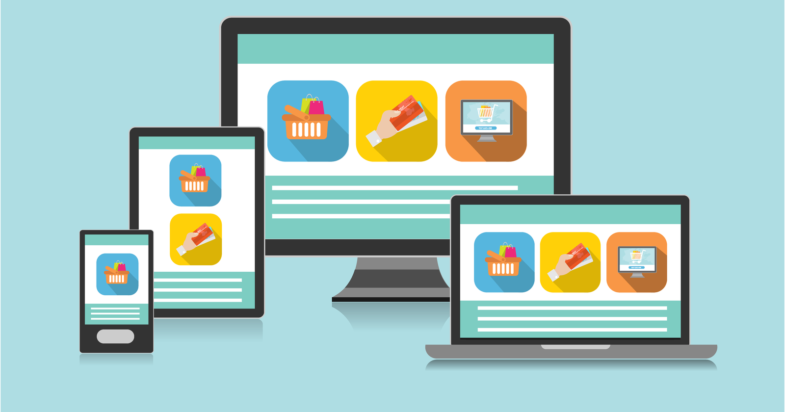
Over the years, the smartphone has become the manager of almost every person owning this type of mobile device. And what follows? We are constantly online, browsing websites, social media, and making online transactions, all on a small screen. At this point, the role of your store is to provide the user with an experience that makes navigating the online store easier. Responsiveness of the e-commerce website, i.e., adapting it to mobile devices, will also be a good excuse for Google to boost your store's position in search results.
Make sure the website navigation is simple.
The easier access to a product you provide, the higher the probability that the user will stay on the site longer in search of a product. Ideally, your store's menu should contain no more than 7 items. It's best to focus on simplicity at this point. Also, remember the ability to search for products using the search feature in your store.
CALL TO ACTION button!
Have you thought about the impact of colors on conversion on your website? It’s essential that the color scheme highlights key buttons and information leading a user to a transaction. Studies show that orange buttons can increase conversion by around 32%, while red ones may improve it by around 21%. You should also pay attention to the appropriate message on the button, such as check, discover, start, etc.
The omnipresent sharing - social media.
Over the past decade, social media platforms have multiplied their users to such an extent that they have become a powerful sales tool. That’s why it’s so important to include social buttons to increase your business visibility.
Black and white - hierarchy.
To maintain ease of reading and understanding the content and information on the website, it's essential to introduce content breaks. Studies show that such actions can increase engagement by up to 20%. Adding white margins to the left and right of the text, as well as between paragraphs, also increases the potential for interactions like CALL TO ACTION.
Equally important - colors.
Colors on the website or online shop, contrary to appearances, play a significant role. They are not only meant to build the visual identity of the brand but also to make it easier to highlight key points that guide the user to a transaction. You should choose a main, dominant color and then complement it with complementary colors that will be used in branding.
Further graphical struggles.
Animations. This is one of the more challenging aspects of building the visual part of a shop. We all know how unwanted animations can turn a happy user into a potential customer who wants to leave the site as quickly as possible. Preparing appropriate animations to enhance e-commerce may not be the fastest action, but it is certainly worth your attention.
Visuals are everywhere.
Let’s not deceive ourselves—what first grabs our attention is graphics, not text. This is confirmed by a report, which found that even on a page like “about us,” users spent 10% more time looking at graphics than reading the content. For your efforts, you can use ready-made graphics found in stock resources, or if you have a budget, you can increase engagement by adding unique, dedicated graphics created specifically for your business.